手写 object-fit-contain
需求
碰到了要保持比例,但是要宽高尽量填充满父容器,就跟img标签的object-fit: contain一样,只不过是div填充div
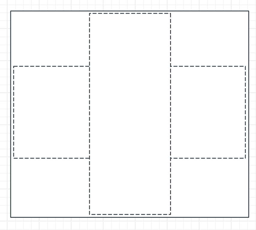
按上图所示,应该实现content不管什么比例,都应该被外层的container裹住,同时content要维持比例最大填满,实现object-fit: contain效果
实现
父容器
固定宽高即可,貌似也可以自动
.parent {
	width: auto;
	height: auto;
}
子容器
需要两层div,外层叫child-outer,内层叫child-inner
.child-outer {
	max-width: 100%; // 限制宽高
	max-height: 100%;
	width: auto;
	height: 100dvh; // 设置100dvh,实际上会被 max-height 限制住
	aspect-ratio: w/h; // 任意宽高比

	// 可以写一些居中的样式,如果你的目标是居中,那么outer、inner两个都要写
	position: absolute;
	top: 50%;
	left: 50%;
	transform: translateX(-50%) translateY(-50%)
}

.child-inner {
	max-width: 100%; // 限制宽高
	max-height: 100%;
	width: 100dvw; // 设置100dvw,实际上会被 max-width 限制住
	height: auto;
	aspect-ratio: w/h; // 任意宽高比,跟outer一致

	// 可以写一些居中的样式,如果你的目标是居中,那么outer、inner两个都要写
	position: absolute;
	top: 50%;
	left: 50%;
	transform: translateX(-50%) translateY(-50%)
}
原理
首先通过设置outer的宽高都限制为100%,然后设置aspect-ratio维持比例,并且高设置为100dvh
这样outer就会表现出高度填满并被max限制,但是宽度跟随aspect-ratio维持比例的样子
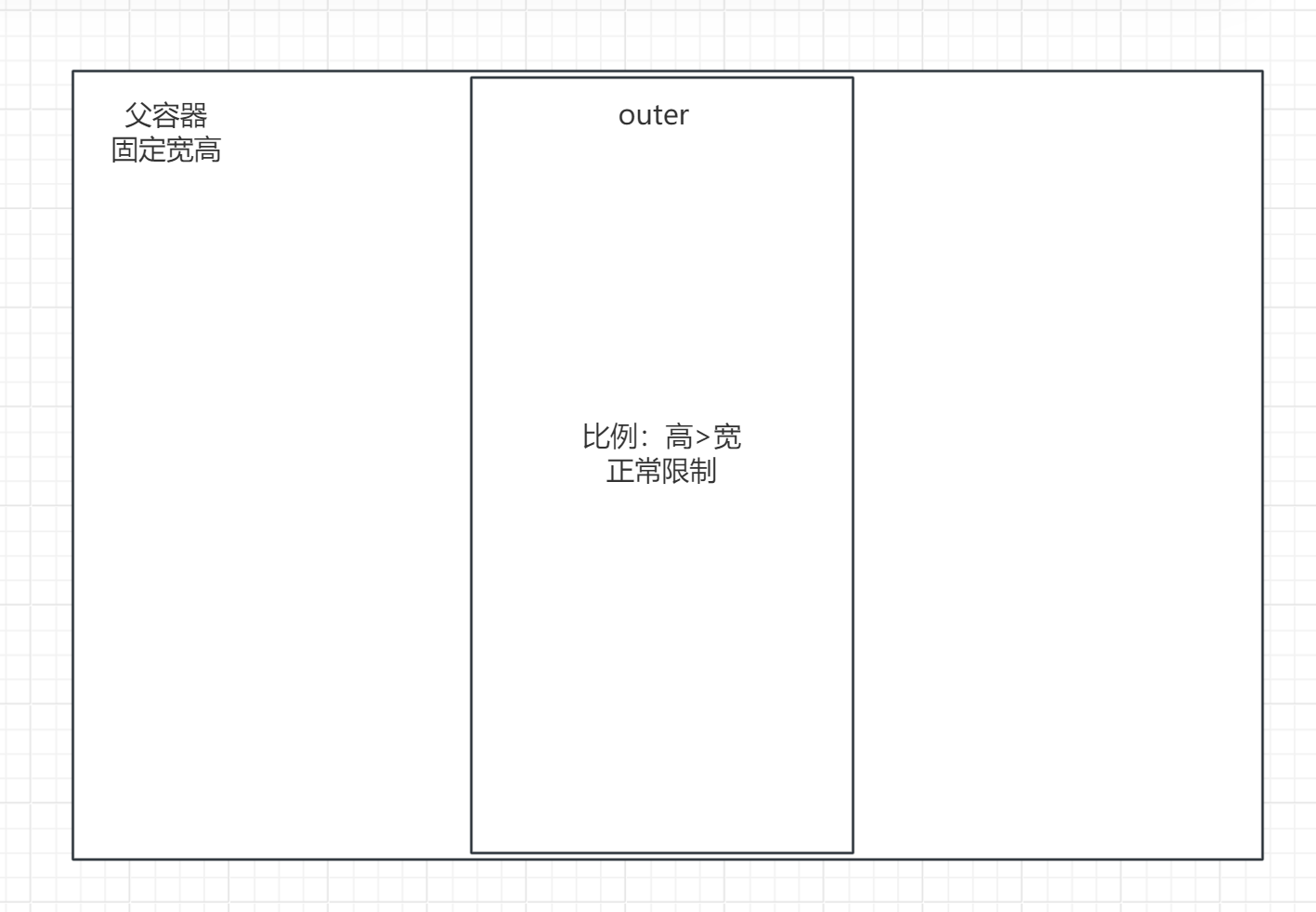
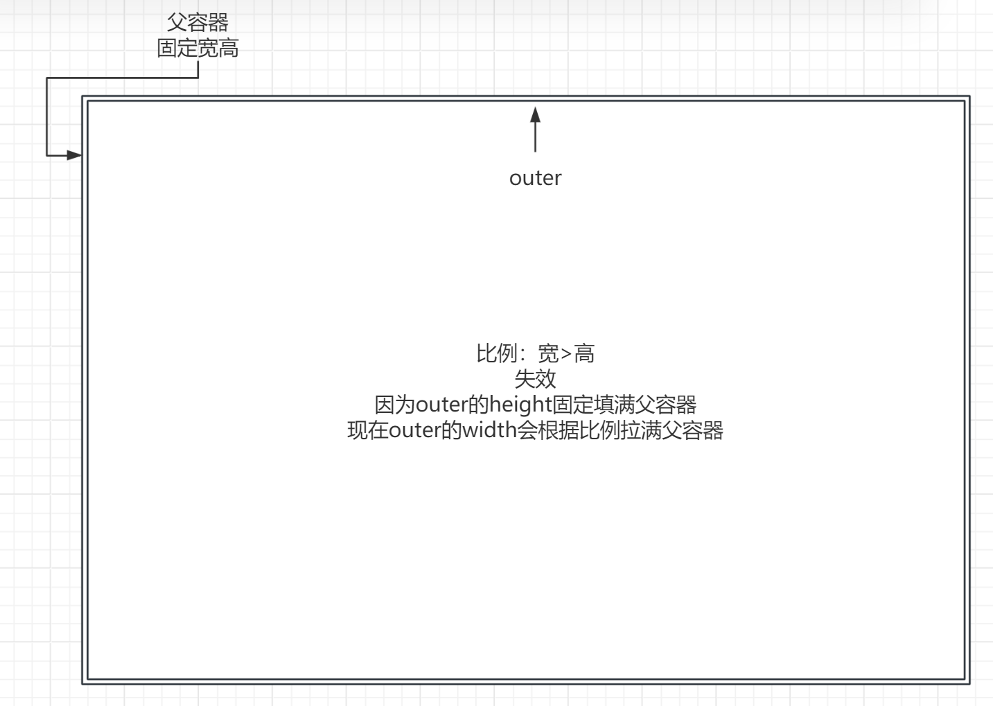
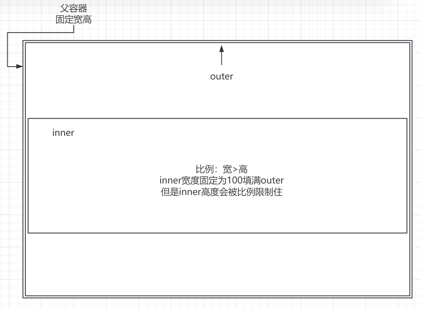
但此时还不行,只能适应“竖条状的比例”,因为高度是固定填满的,如果宽高比变为宽长高短,也就是横条状div,那么宽度根据“aspect-ratio”,就会变得比高还长,硬是填满整个父容器
但是可以如法炮制,前面的方法让我们可以只在“竖条状”比例的时候完美contain,那么把这个子容器再当父容器,设置成“横条状”比例的时候完美contain,那这样两个div互相限制,最里层就符合要求了
所以inner的宽高都限制为100%,然后设置aspect-ratio维持比例,并且宽设置为100dvw
这样inner就会表现出宽度填满并被max限制,但是高度跟随aspect-ratio维持比例的样子
这样两个div套住之后,如果比例是“竖条状”,那么outer的aspect-ratio发挥作用,inner的100dvw会因为max被限制在outer上
如果比例是“横条状”,那么outer的100dvh会被max限制在父容器上(表现为填满父容器),而inner的aspect-ratio发挥作用
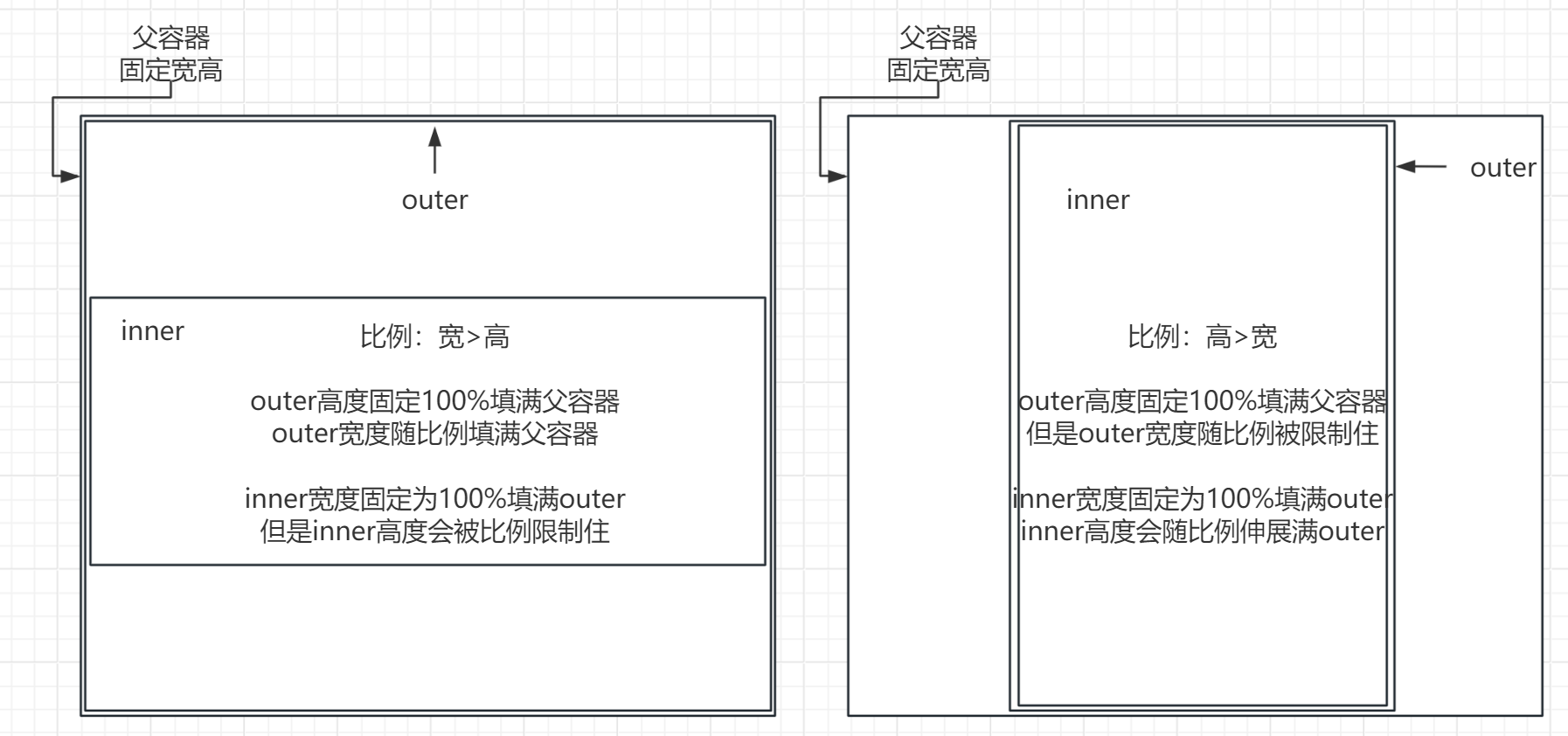
由于“横条比例”时outer表现为填满父容器,因此居中也需要对inner设置一次,不然inner会掉到outer顶部
文章作者:xChenNing
文章链接:http://localhost:8090/archives/shou-xie-object-fit-contain
版权声明:本博客所有文章除特别声明外,均采用CC BY-NC-SA 4.0 许可协议,转载请注明出处!
评论